
Need honest thoughts — does this monster design work or is it too much?
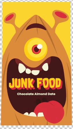
Hey again! Just wanna get some real feedback on this previous packaging design we’ve worked on. It’s for a healthy candy bar tentatively called *Junk Food* (yeah the name’s on purpose lol).
We’re trying to go for something **outrageous** — like, packaging that really jumps out at you. Not the usual clean and minimalist look. We’re aiming for that same kinda vibe as **Liquid Death** — chaotic, a bit dark, kinda ironic in a fun way (the reason why its called JunkFood). That’s why we went with this monster character.
The goal is to make something that *looks unhealthy* but actually isn’t. It’s a date-based bar with cashew and good ingredients, but we wanted the branding to feel funny, ironic, and just... loud.
Target audience is **Gen Z**, so we wanted to stay away from the usual clean/minimal look and try something more in-your-face. Curious to know what you think:Is the monster too much?
Does it look fun or just confusing?
Would this catch your eye in a store or just make you walk past?
Also read all the comments from my last post and super grateful for everyone who replied — you guys were actually really helpful 🙏